Who better to introduce the last
few selections of fun than New Neighbor #9:
 Scary Clown Guy.
I've said it before and I'll say it again: I just don't have that much control over how the facial expressions turn out. I only hope the person who is getting this piece wasn't planning to use it in a child's room -- I'd hate to provide the genesis of future therapy bills.
After all this serious talk about serious books,
I guess it's time to wind up Small Works' Summer Reading Recommendations with the kind of books that won't tax your brain one bit more than is necessary to operate your eyes --
Some tasty little visual treats in book form seem to me to be just the thing for a summer afternoon. Especially if there's a cold diet coke handy as well.
I was at Barnes & Noble a few weeks ago just killing a little time skulking around the art section when this little gem caught my eye:

and I immediately had to purchase 2 (two!) of them, with no guarantee that I won't be needing more.
I may be the last person on the planet to board
the Marc Johns bus,
but I'm certainly happy I hopped on before he left the station.

The thing I love most about his work is that it seems to be completely effortless.

Like he just sat down and did a little doodling every morning before work, or something.

The best work often seems to be so, doesn't it?

For all intents and purposes, he does just about exactly what I do except he does it so very well and so very simply . . .

it makes me wonder why I spend all my time making zillions of tiny stitches when I could just jot my ideas down, add a little watercolor, and have ART.

But of course, I can't draw . . . and I'm not Marc Johns . . . and my ideas probably need the support of all those little stitches to hold them together.
I'd highly recommend this little prize -- one for your own desk or coffee table and one for someone you love (Amazon has the best price on it! Sorry, B & N.)
And no summer reading list would be complete
without my favorite annual July treat:

The CA Illustration Annual never disappoints, and it's on the newsstands now.
I've been collecting the Illustration Annuals for about 10 years, and it's amazing to me how the percentage of work that's digital has grown exponentially over the decade.
Most of the work doesn't look that much different -- but I couldn't help thinking that being a working artist is morphing at warp speed into something that requires a different skill set entirely.
I'm not sure how I feel about the proliferation of digital art. I was talking to my two artist daughters about it at lunch yesterday, and they both seemed to agree that in some ways a lot of art has become less impressive because there's very little of the "how'd they do that??!!" factor left.
 Jody Hewgill, an illustration for "Tender Morsels . . . a magical story about the beauty and brutality of a woman's relationship with a wild bear-man."
But the thing I love most about the Illustration Annual is that I not only get to see a great picture, I get an explanation of the concept behind it. I love understanding how someone's brain got
from point a to point b --
 Jon Reinfurt, an illustration for "Harmony Finally . . . an article that compares the abilities of three conductors competing for the same job."
the telling of an effective visual story --
 Steve Adams, "Want to escape?" Some situations make people want to flee.
ideas without words.
 Natalie Pudalov, from the series "Flea Dreams"
Lastly, Hannah and I were cruising through Half Price Books the other day and we happened upon this hardcover beauty for $9.99:

Design gold mine! Ka-ching!
The jacket blurb says: "'Decorative Ornament'" by Owen Jones is a magnificent new edition of his classic 'The Grammar of Ornament.' First published in 1856, this essential illustrated reference has been a source of inspiration for hundreds of artists, designers, and architects, from William Morris and the Arts and Crafts Movement to Frank Lloyd Wright. . . . More than one and a half centuries after its publication, this vital reference continues to stand as a ravishing, authoritative, and encyclopedic survey of great decorative design."
The illustrations are amazing, the colors lustrous (including a lot of metallics) -- for anyone interested in design, it's like having more than 2350 patterns at your fingertips to educate and inspire.
It's taken up residence on my desk.
I hope you've enjoyed Small Works' book tour -- I've already heard from someone who is reading "Art & Fear," and I'm thrilled to hear it.
It means that my work here is done.
Up next: a peek at my latest vintage acquisition,
and a preview of coming attractions for
"Small Works' Week of Itty Blog Bits."


10 comments:
Eek! Scary Clown Guy! I like him though. He looks harmless.
I love the picture of the woman leaving. And I'm getting a copy of the decorative ornament book - a must have! Thanks Susan!
I loved the picture of the woman leaving too -- it was hard to choose a few to include, but I knew I had to have that one. Very cool.
I too immediately went to Amazon to order Art and Fear after I read about it in your blog. I am reading it now, as I write. How did I ever get through four years of art school and a lifetime career as an artist and not know about this little gem. Your summer book tours are costing me a little fortune and have prompted an overhaul of my own library shelves! Gotta love it!
The book tour was great. I love, love, love the annual Communication Arts.
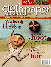
I'm a bookstore junkie, you are bad for my pocketbook. Over the weekend I got Art and Fear and have started reading it. I also picked up (finally) the Cloth, Papers, Scissors issue with you in it. For some reason I thought I'd already bought that issue til I leafed thru it and realized that was your issue and I DIDN'T have it. I do now. Fun to see you in print.
Now I might have to pick up more books.
And I love Scary Clown Guy. He's got a perfect expression.
Thanks for your kind acceptance of scary clown guy -- we both feel better about ourselves.
I'm re-reading Art & Fear as well, and I swear that book is just like someone has actually been inside my head and is writing about it. Talk about scary . . . but isn't it wonderful to find out that everyone has the same issues? It's a wonder any art ever gets made at all. Says something about the drive to create.
i want a giant poster of scary clown guy.
and i must have h is for holy crap!! it looks awesome!
i love your book recommendations. it is so nice to have a mom that shares some of my passions. or, conversely, i bet it's nice to know that you passed on something so important to you!
love you!
Thanks, Chels . . . yes, I'm so glad to know I passed on a few of my good qualities along with some of the less desirable traits, but we won't go into those here. xo!
Susan I enjoyed all that visual eye candy, and your clown guy is fabulous! No time to peruse book stores these days so this was a great treat...I LOVE Marc Johns work and have not seen it before either.. thanks so much for sharing!
Hey, I finished Art and Fear yesterday. Good book, has lots to say to me and I'm already reading back. I keep finding more and more as I reference back and forth.
Glad you liked it, VO -- yeah, it's definitely a read and re-read -- sometimes I just pick it up and don't have to read far to find a great line or two. Now if I could just apply everything in there I'd really be going places.
Post a Comment